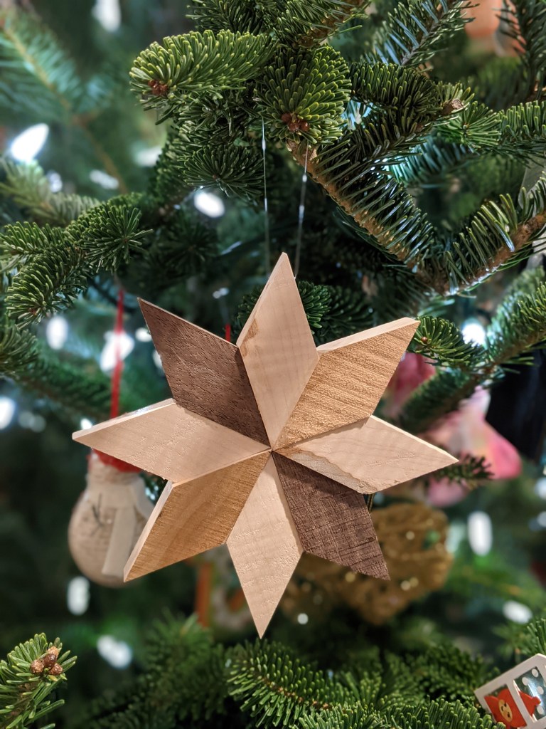
In search of a fairly simple ornament to make as a gift, I dug around online for a bit and got some inspiration from various different sites. I had hoped to do something more three dimensional, like a Moravian star, but didn’t have the right stock for constructing the pieces. So, I ended up with this design, fairly straightforward construction of eight parallelograms cut from a couple different pieces of wood to the same dimensions.
I happened to have long strip of maple that was rough on one side and sanded on the other and about an inch and a quarter across. I set my miter saw to 45 degrees, sliced off the end, and then measured the length of the angled cut. I then transferred this measurement to the straight side and used that to make another 45 degree cut further along the board, yielding a parallelogram with 4 equal sides. Repeat many more times. 🙂 For a little visual interest, I traced the shape on to some scraps of walnut that I had from an earlier project.
Assembly was a matter of laying out the pieces on the workbench and moving them around until I found the design that was most pleasing to my eye. Finally, to glue it all together took several shifts, gluing and clamping two pieces together at a time, until the entire star was assembled.
Are you using or overriding View.hasFocusable() in your application? Watch out for behavior changes in Android O and a newly added View.hasExplicitFocusable(). The behavior of hasFocusable() will change depending on whether you are targeting SDK 26, or an older version, while hasExplicitFocusable() maintains the pre-O behavior of hasFocusable(), regardless of the SDK version that you are targeting.
If you are overriding hasFocusable(), know that some framework locations that used to call hasFocusable() have been changed to call hasExplicitFocusable() instead. In particular, AbsListView‘s touch handling code now uses hasExplicitFocusable() to determine whether or not to execute the onItemClick() function, or to delegate the click to the child view within the list.
I have recently spent some time getting all the appropriate drawable assets together for the notifications in an app, including support of Lollipop, Wear, and pre-Lollipop devices. Unfortunately, it took a lot of digging and a bit of trial and error to get everything right, so I figured I would document everything in one place in the hopes that it helps someone else (or, maybe it helps me next time I’m trying to remember how I did all this).
TL; DR
DEVICES
SIZE
PADDING
COLOR(S)
DENSITY
SMALL ICON
phone, tablet
24×24 dp
1 dp
#ffffff, transparent
any
ACTION ICON
phone, tablet
32×32 dp
4 dp
#ffffff, transparent
any
ACTION ICON
wear
64×64 dp
8 dp
#ffffff, transparent
hdpi
BACKGROUND
wear
400×400 px or 600×400 px
any
any
nodpi
Small Icon
The small icon is in the lower right corner of a notification on Ice Cream Sandwich through KitKat and gets put inside a circle and brought over to the left on Lollipop. One version of the icon will be equally suited for use on all of those platform versions. The icon should be 24×24 dp with about 1 dp of padding on each side. It should be pure white (#ffffff) on a transparent background only, using the alpha channel as needed for blending. Provide as many different densities (e.g. xhdpi, xxhdpi, etc.) as needed.
Action Icon
Action icons are used with any actions that you may add to your notification, for example the Delete or Archive button that GMail adds to a new message notification. These icons should follow the Action Bar icon sizing parameters: 32×32 dp with 4 dp of padding on each side. These should also be only pure white (#ffffff) on a transparent background, using the alpha channel as needed for blending. These icons will be automatically re-colored on Lollipop devices, no additional assets required. Provide as many different densities (e.g. xhdpi, xxhdpi, etc.) as needed.
For Wear, you will want alternative versions of your action icons or you will end up with your icons being scaled up significantly and looking blurry on Wear devices. The Wear versions should be double the size of the phone and tablet version: 64×64 dp. However, currently you only need to provide hdpi versions for Wear. So, ultimately, you just need an hdpi asset that is 96×96 px. You must also name these Wear versions differently so that they do not collide with your phone/tablet version.
Background
The Background is used only for Wear devices. It should be 400×400 px or 640×400 px, density independent. It can be full color. A 640×400 version will parallax more than a 400×400 version, which may not parallax at all, depending on the device being used. Since they are density independent, these assets should be placed in your drawable-nodpi directory.
On initial glance, the layout_alignBaseline attribute that can be added to children of a RelativeLayout seems like a handy little tool that is used just as easily as the more common layout_alignTop and layout_alignBottom. The good news is that if you’ve only got a couple of views, it works great! The not so good news is that if your layout gets just a bit more complicated, things fall apart in a hurry.
Let’s say you have a nice design that you need to implement:
I’m not here to argue about what layout is the absolute best for this situation. But, for argument’s sake, let’s say you decide you can easily build this with a RelativeLayout with three children. Nice, flat hierarchy. You might end up with something like this:
So, “United States of America” lines its baseline up with the baseline of “MI” and then “Michigan” sits on top. Perfect. But then you look at the rendered output of that layout:
So, what went wrong? Did you mess up one of the layout attributes? Turns out it is actually a limitation of RelativeLayout. If you dig into the source (line 519), you will notice that baseline alignment is performed after all other vertical alignment has already been performed. In other words, “Michigan” is lined up above “United States of America” when it is still in its default position at the top of the RelativeLayout container. Then, later on, “United States of America” is re-aligned with the baseline of “MI,” leaving “Michigan” just out of view, above the top of the RelativeLayout.
One potential solution to this problem is to wrap the two smaller TextViews in a LinearLayout that can then be properly baseline aligned with the larger TextView on the left. For example:
Voila! We get the desired result at the expense of an extra level in the View hierarchy. Oh, and did you notice that neat, relatively rarely used attribute on the LinearLayout? In case you missed it, baselineAlignedChildIndex is a cool little trick to tell the LinearLayout which of its children should be considered when lining up the entire LinearLayout with another View. Very handy!


 Scott Weber
You must be logged in to post a comment.